Mobile-First Design: Capturing the Mobile Audience
The Mobile Majority
Statista reports that mobile devices generate over 60% of global website traffic. Designing for mobile first isn't a trend — it's a necessity.
Google's Mobile-First Indexing
Google primarily uses the mobile version of your website for indexing and ranking. A poor mobile experience means poor SEO.
Thumb-Friendly Navigation
Mobile users navigate with their thumbs. Touch targets need to be at least 48x48 pixels, and important actions should be within easy thumb reach.
Fast Loading on Mobile Networks
Mobile users often connect via slower networks. Speed optimization is even more critical for mobile — every millisecond matters.
Progressive Web Apps
PWAs offer app-like experiences without requiring app store downloads. They work offline, load instantly, and can send push notifications. Learn more in our web trends article.
Simplified Content
Mobile screens have limited space. Prioritize essential content, use collapsible sections, and ensure text is readable without zooming.
Mobile-Optimized Forms
Long forms kill mobile conversions. Use auto-fill, progressive disclosure, and minimal required fields for landing pages.
Location-Based Features
Mobile devices enable location-based services — store locators, local offers, and proximity notifications that desktop can't match.
Mobile Payment Integration
With Apple Pay, Google Pay, and mobile wallets, e-commerce on mobile is faster and more convenient than ever.
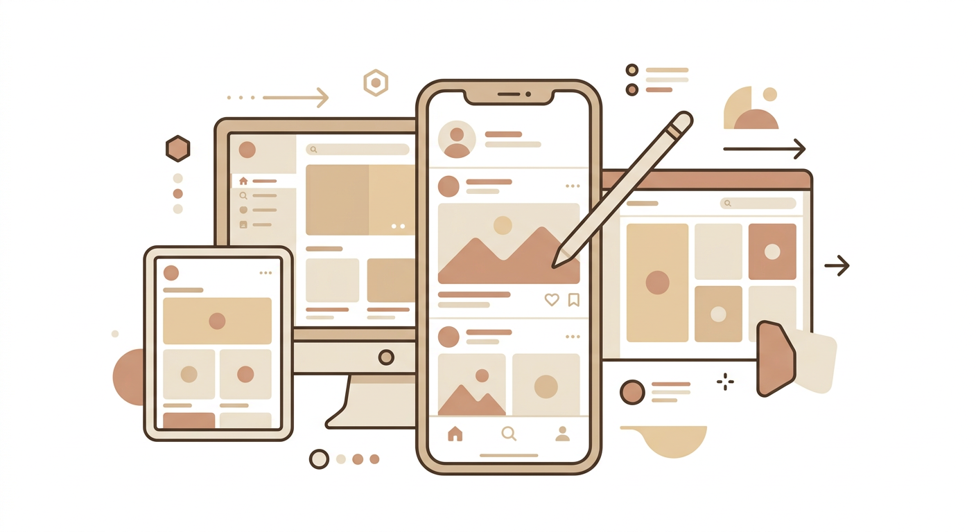
Testing Across Devices
Responsive design testing across real devices ensures your website works perfectly for every user.
Need a mobile-first website? Contact Starlight Solution for expert mobile design that captures and converts the mobile audience.