How Responsive Web Design Boosts Customer Engagement
The Mobile-First Reality
Mobile devices now account for over 60% of global web traffic. If your website doesn't work perfectly on every screen size, you're losing more than half your potential audience.
What Is Responsive Design?
Responsive web design automatically adapts your website layout to fit any device — desktop, tablet, or smartphone. At Starlight Solution, every website we build is fully responsive by default.
Google Prioritizes Mobile-Friendly Sites
Google's mobile-first indexing means your mobile site is the primary version Google evaluates for SEO rankings.
Lower Bounce Rates
Google research shows that 53% of mobile users leave a site that takes longer than 3 seconds to load. Responsive design ensures fast, optimized experiences.
Higher Conversion Rates
Responsive websites see up to 64% higher conversion rates compared to non-responsive sites, according to Think with Google.
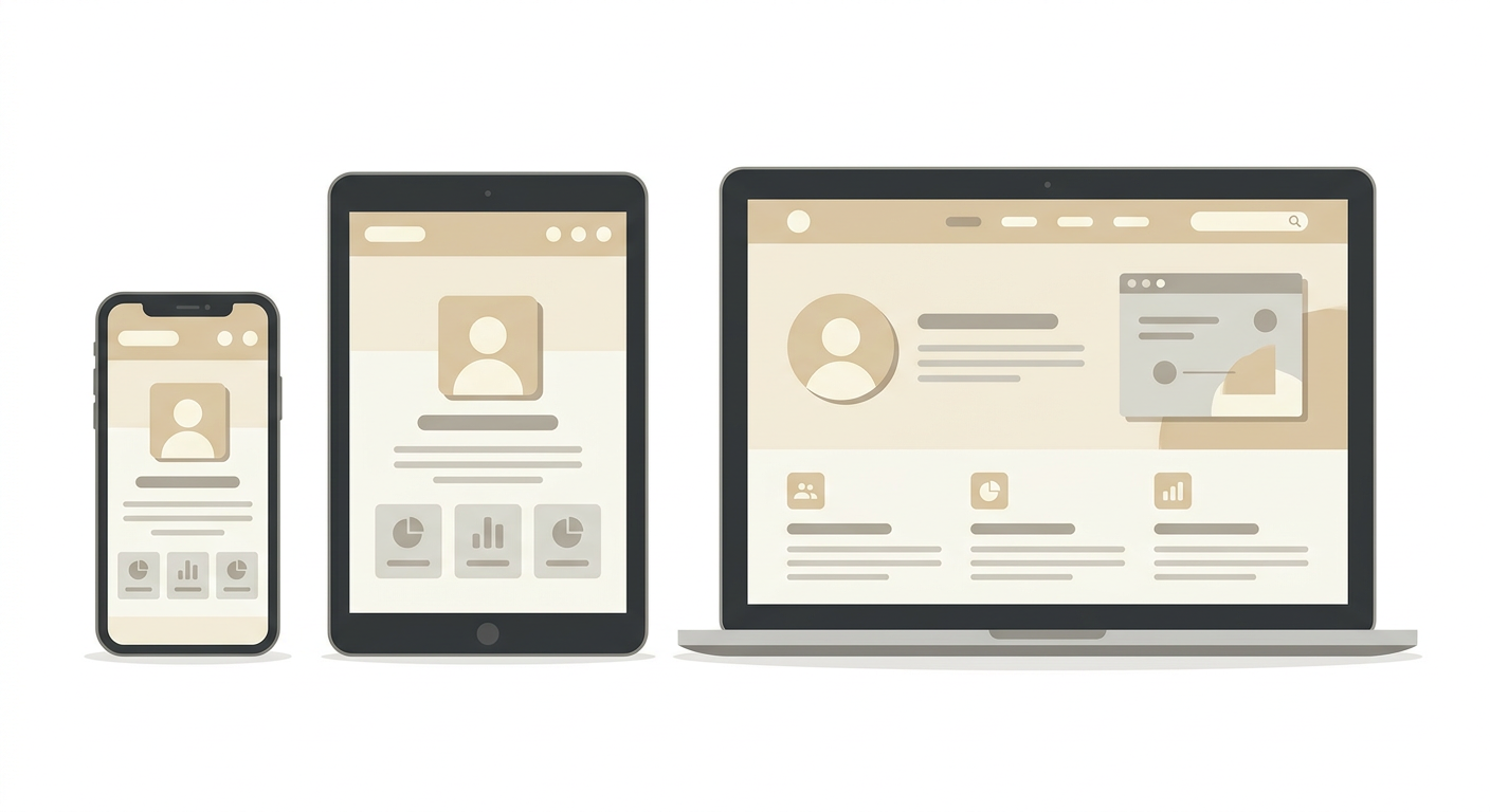
One Website, All Devices
Instead of maintaining separate desktop and mobile sites, responsive design gives you one codebase that works everywhere — reducing maintenance costs.
Improved User Experience
When users can easily navigate, read content, and interact with your site on any device, satisfaction increases. This directly impacts your brand credibility.
Better Analytics
A single responsive site means unified analytics. You get a complete picture of user behavior across all devices in one place, enabling smarter data-driven decisions.
Future-Proof Your Website
New devices and screen sizes emerge constantly. Responsive design uses flexible grids and breakpoints that adapt to any future device automatically.
Cost-Effective Long Term
Building one responsive site is significantly cheaper than building and maintaining separate versions for different devices.
Need a responsive website? Starlight Solution builds modern, responsive websites that perform beautifully on every device.